Inferred Ancestry Dashboard
Select one or more rows in the Table tab.
Population-specific accuracy confidence intervals
Admixture proportions by molecular profile
Introduction
This application is designed to interactively visualize genetic ancestry inferred from human molecular data other than whole-genome or whole-exome sequences of cancer-free DNA. Some examples of data it can handle includes targeted gene panels, RNA, whole genomes and whole exomes that can all include cancer-derived nucleic acids.
Source code and additional information for this application are available via the Inferred Ancestry Dashboard GitHub repository
Application usage
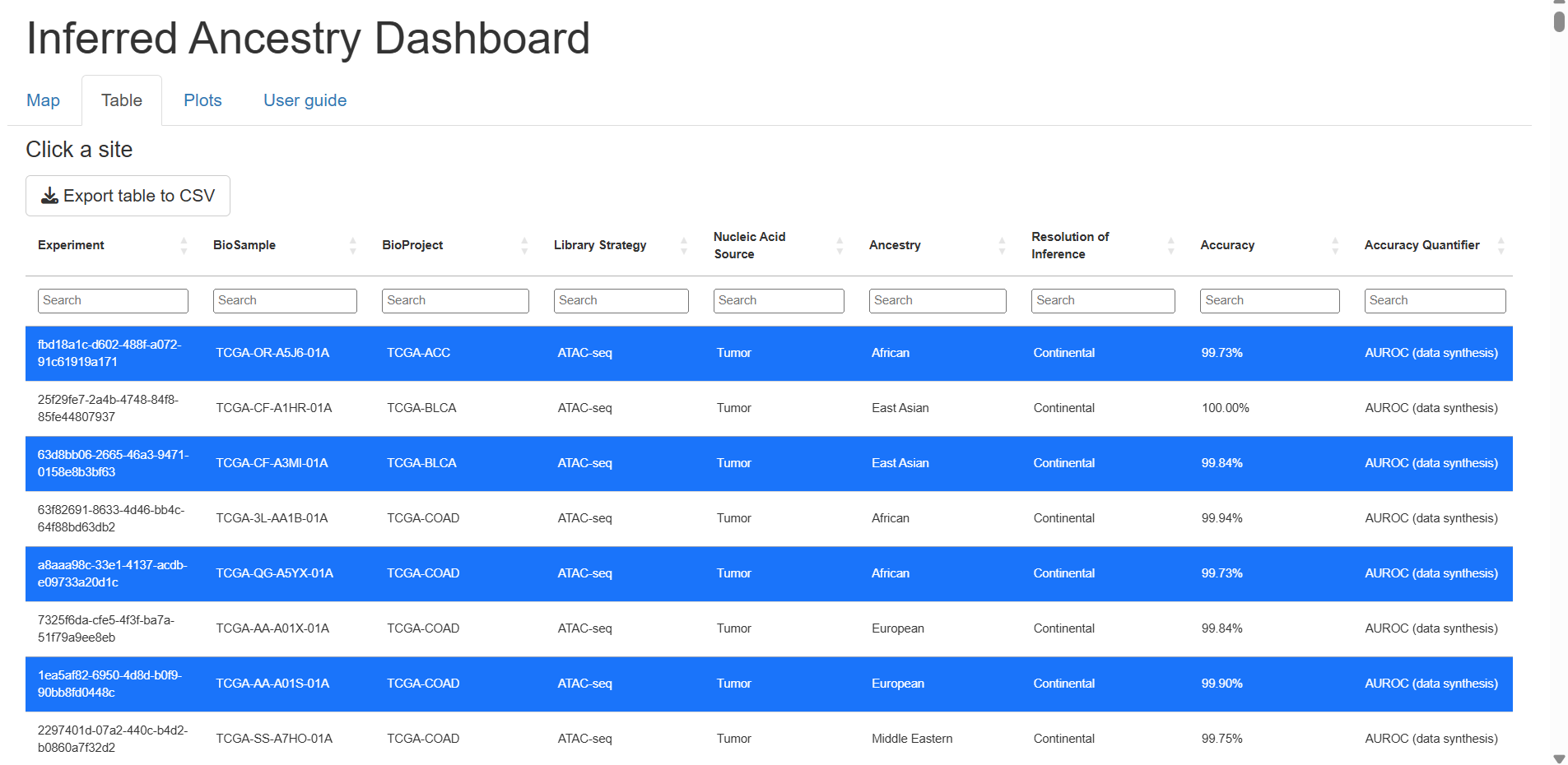
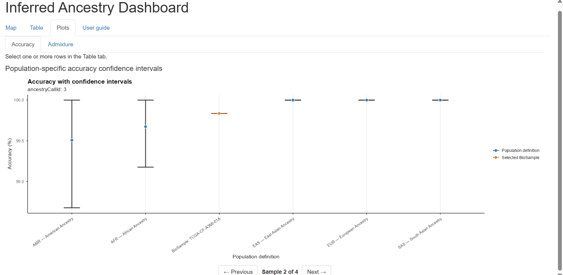
The application has three main features for analyzing inferred ancestry from cancer-derived molecular data: a map, a data table, and a set of plots given the selected data. For each sample selected in the table, a plot of the population-specific ancestry accuracies and their confidence intervals for the full set of populations that the inference method is trained on as well as for the inferred ancestry of the selected biosample. These plots are generated in the Plots tab and the user can scroll through the plots for each selected sample using the buttons at the bottom of the page.
Table Sample Selection
Confidence Interval Plots
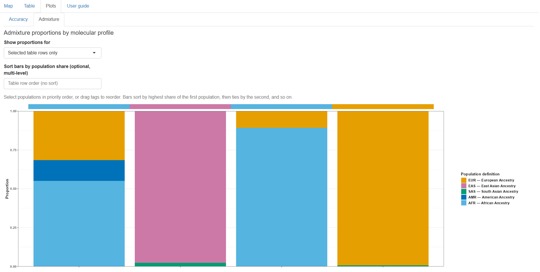
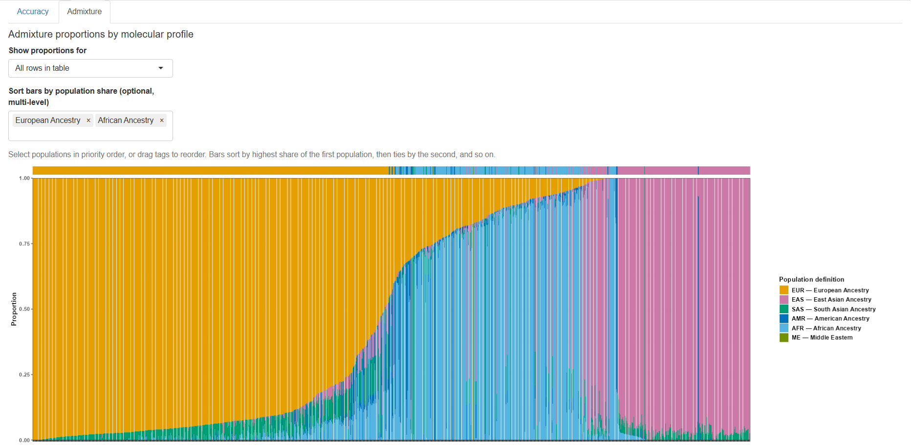
The Plots tab also contains a subtab for viewing the Admixture plot. Users can choose to view the admixture proportions for all the samples in the table or only samples that were selected in the table. The stacked bar plot displays the samples on the x-axis and the proportion of the admixture of each population in the sample on the y-axis. The stacked bar plot is color-coded by population. Users have the option to sort samples by population proportion amount. Users can add to the input selection the order of populations to sort by highest proportion first and users can reorder tags in the input to resort the priority of the population.
Admixture Proportion Plot of Selected Samples
Admixture Proportion Plot of All Samples Sorted
Package dependencies & credits
This application depends on functions contained within the RAIDS R-package. Special thanks to R packages leaflet, leaflet.extras, and Shiny.
Package dependencies:
	DBI,
	dplyr,
	DT,
	htmltools,
	leaflet,
	magrittr,
	pool,
	RSQLite,
	shiny,
	shinycssloaders
Help & feedback
For additional help or to submit feedback or bug reports, please contact:
Rebecca Hassett
Cold Spring Harbor Lab
hassett@cshl.edu